Croce di Malto
Studio
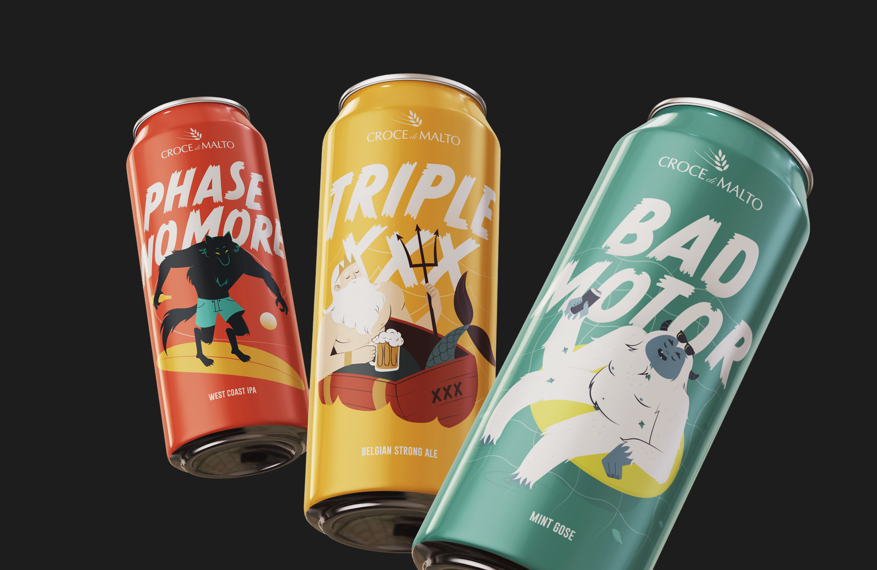
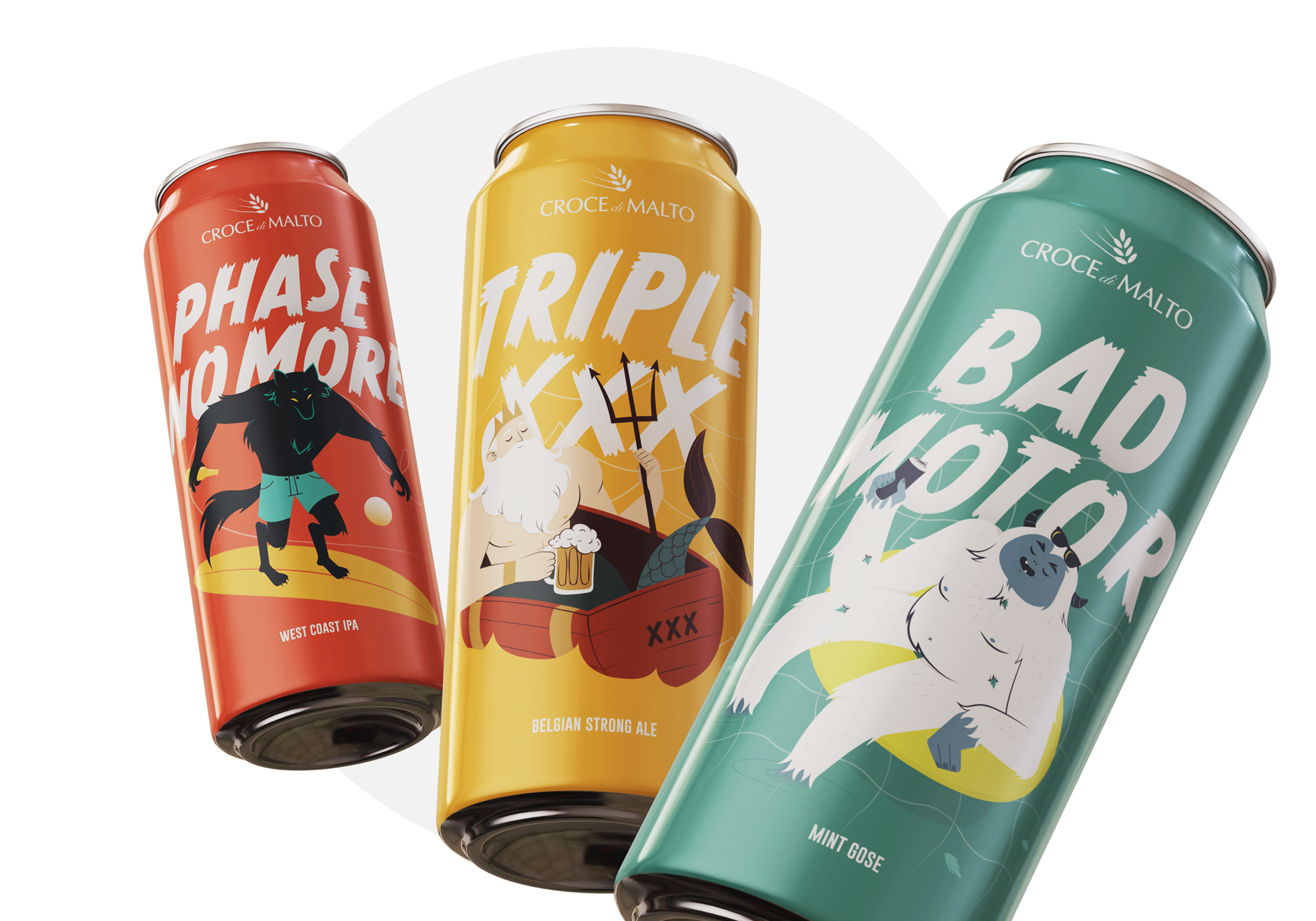
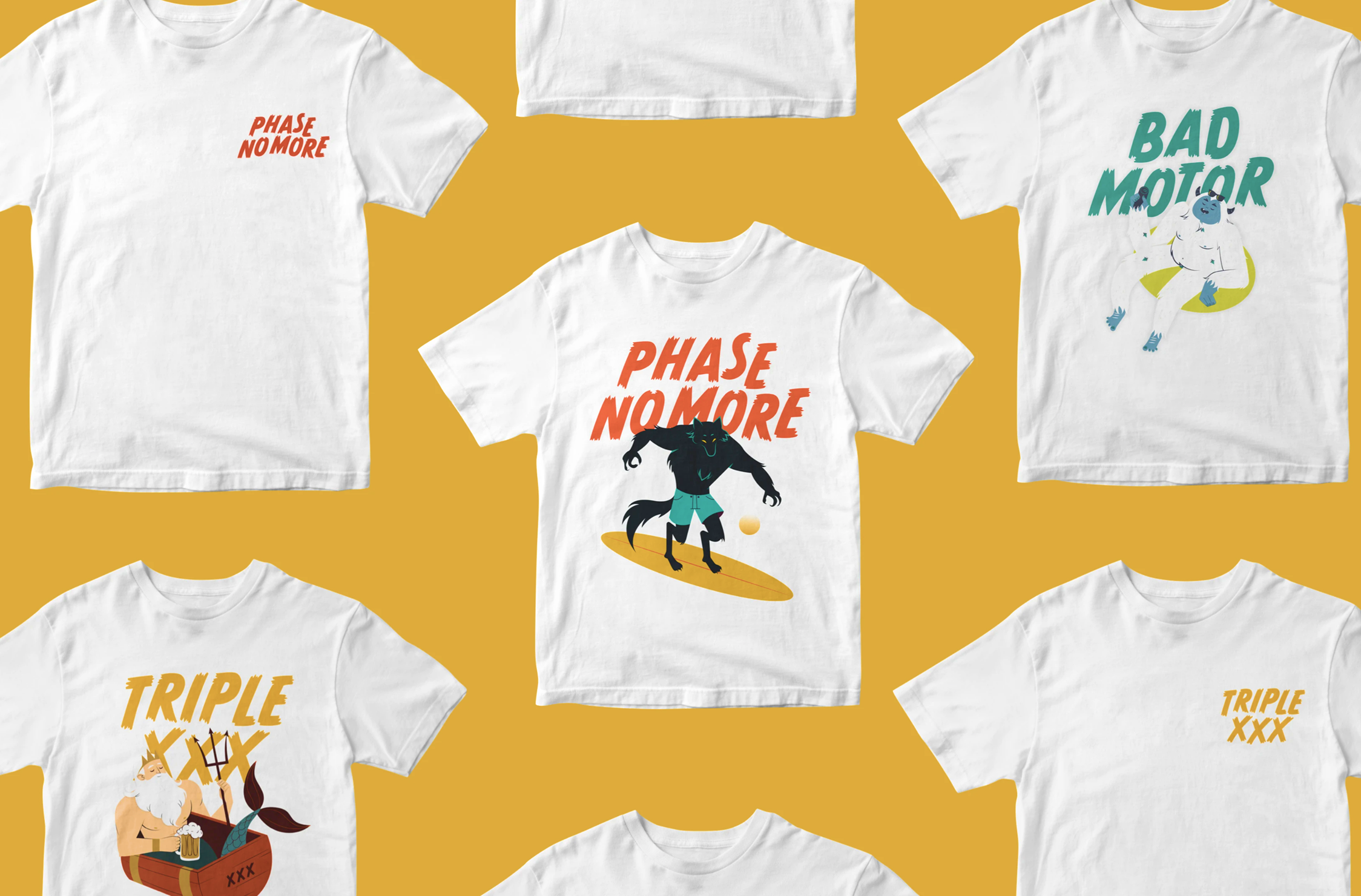
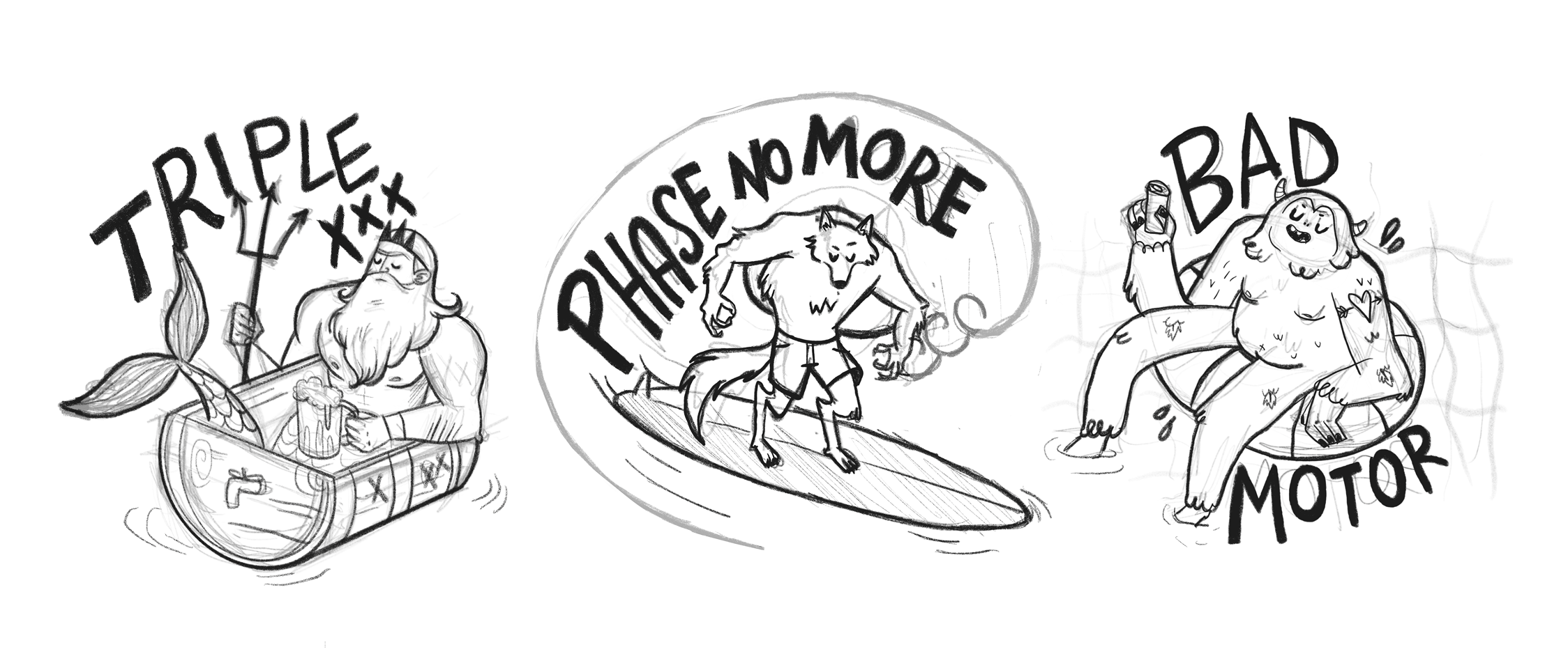
In parallel, we designed three illustrated limited edition cans dedicated to the most iconic beers in the catalog: Triplexxx, Bad Motor, and Phase No More.
- Brand Design
- Illustration
- Packaging Design
- Creative Concept Campaign
- Logo
The creative choices
The project started from structured stylistic research: four directions explored (classic/elegant, minimal typographic, flat minimal illustration, flat colored illustration) and a deliberate choice not to standardize the three cans. Each beer received an autonomous visual identity, consistent with the character of the product: Triplexxx with a dark typographic treatment and gold botanical details, Bad Motor with a flat-style illustrated character and green palette, Phase No More with a soft illustration on warm tones. Three cans, three visual languages, one brand consistency.
A visual identity that speaks before you do.
These projects demonstrate one thing: a well-designed identity isn't ornamentation, it's a strategic tool. It reduces the effort of explaining yourself every time, makes you recognizable at first glance, and positions you exactly where you want to be.
Whether you're launching a brand, renewing your image, or building a product line, the starting point is always the same: who you are, who you're talking to, and what you want people to feel when they meet you.
If you're looking for someone to transform these answers into a coherent and memorable visual identity, we're here.